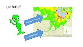
At last summer Street for Life (S4L) and Cottenham Beach Party events by Extinction Rebellion (XR) Cambridge, a simple sea level rise map was a hit with children and adults alike: I simply stuck on cardboard backing an Ordnance Survey 1:25,000 Explorer map of Cambridge on side, and villages immediately north on the other. The +5 and +15 m. sea level rises (SLR) from the 2006 firetreemap were hand-drawn, but eyeballing it made it pretty inaccurate... and +15 and +5 m. were picked because they overlapped Cambridge and villages north, rather than anything scientific!
 |
| Cottenham Beach Party |
 |
| click to enlarge |
So we went from this GIS map:
...to this paper map north of Cambridge, a custom 1:25,000 OS Map, site of most of the encroachment :
The black lines are the original eye-balled 5 and 15 m. levels, and in RGB are those respectively for 6, 2 and 0 m. from the previous blog post.
BSL on the middle map means "below sea level" - whilst it remains dry due to constant drainage of the Fens, it's an invisible barrier to travel E-W among villages immediately north of the city - one must travel south to the A14 trunk road at the common border of both maps, or north via Soham at very top of the top map.A question that came up repeatedly at both events, was "OK, so when is this going to happen?". We now we have better timing constraints on the sea level rise models:
Voila! A cool mix of old and new... A refurbished map ready to help explain Fenlands inundation in the context of the current Climate Change among localised efforts to raise our awareness. Let me close with a lighthearted closing slide to a local village event:


No comments:
Post a Comment
Thanks for reading! Please share in Comments your questions & stories...