Part I showed how high contrast map symbology of Sea Level Rise can be transferred to a paper map to take around events. When asked if I could scan and reprint that paper map, I thought: why print a hand-transfer, why not print the digital original? Better still: why not try and enhance that digital map to really give an impression of sea level rise gradually invading the land?
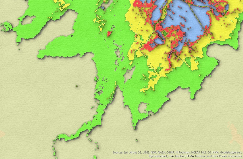
Enter @john_m_nelson's treasure trove of ArcGIS Pro map styles, augmented by not a few YouTube videos on those and beyond. Papercut works well for topography, but following his advice "not to use tools as originally intended" - a must-see is his masterclass in Geospatial Frontiers - I wondered if it could illustrate the sea creeping over land? Tan (above sea level) and blue (below sea level) are the topography, red/yellow/green are 0.5, 2 and 6 m. sea level rise models explained here with geographic context. Coastal inundation from NE to SW uncovers new estuaries and promontories.
 |
| click to enlarge |
So far so good - but where is all this situated? And how about overposting some cultural info (Canadian for roads, rails, rivers, etc.)? Esri World Terrain base map not only separates reference (text on top) from base (map at bottom), but this base is skeletal so it can be posted atop too...
 |
| click to enlarge |
The geologist, geomorphologist or civil engineer in you may notice a top slightly right of center a levée: A story map will detail that aspect, as well as develop more on the previous paragraph.
So there: a poster tying in sea level rise model with local infrastructure, using GIS tools not always as originally intended. Why don't you use the lockdown too, explore new ways to show perhaps old maps?
Notes:
- posters are shown here with choices of colour (Papercut RG) and blue-tone (Papercut B)
- posters showing this are explained and linked in the story map mentioned in the update at top
- posted a swipe map with DEFRA high resolution terrain model that show even more features
- in turn described in the addendum to the story map under Please Sir... in new top level menu
 |
| click to enlarge |
No comments:
Post a Comment
Thanks for reading! Please share in Comments your questions & stories...