Ruth Lang created this excellent mashup for the 2010 FIFA World Cup - which coloured all the countries at the beginning and gradually greys them out as they are eliminated - only Spain and the Netherlands are left as at today. This was a labour of love, needing for example some tweeking to work in the Firefox browser, and a testament to SVG.

click on map to go to web app
I happened to be on Geocurrents RSS feed, which alerted me to this post also on the same topic.

click on the image to go to web page
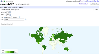
Toward the bottom, however, there's a spreadsheet with some more geodemographic data in spreadseet format keyed by country. Presto! I upload that to Google Fusion tables of which I had some already, and I created another mashup in a matter of minutes.

click on map to go to web app
Needless to say there's hardly a comparison between these two maps, one is a polished product (see my previous post on this topic for another) and the other is quick-and-dirty.
But it does show how cheap and easy it is today for anyone to quickly visualise business statistics on a simple map...Is this also not an example of disruptive technology? One painstakingly creates a map, then another gets a slightly augmented dataset on same, only to instantly create a mashup on more data?
In another example, neither GFTs nor other web apps really work that well: compare this GFT
click on map to go to web app
to my previous posting comparing web apps somewhat like here
click on map to go to web app
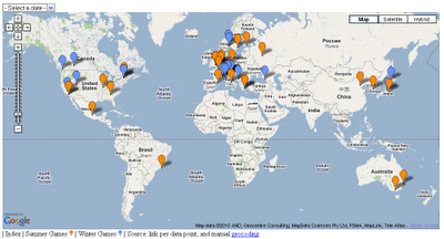
and my earlier posting on the distribution of Olympic host cities
click on map to go to web app

No comments:
Post a Comment
Please send me a copy of your prospectus to