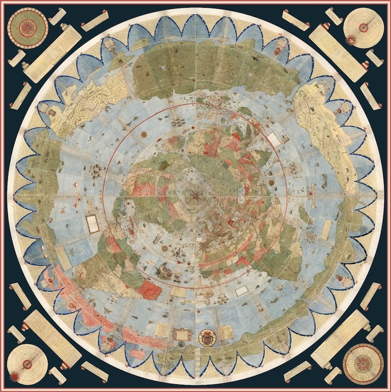
Having explored polar maps here, here and here, was it ever a delight to find one of the earliest maps in that same projection! In This Is the World's Largest and Oldest Map, Culture Trip report how David Rumsey recreated a digital copy of a 1587 map from Milan in no less than 60 pieces:
While you peruse the stunning details of this work, let me give you an update: I'm moving on from professional GIS & mapping, reverting to volunteered geo info (VGI), while I go onto assisting disabled students for fee... I simply tired of working for free! That also means scaling back my megadata hosted on AWS preseted at PostGIS Day 2014, as well as those on AGOL where I'll let my subscription lapse. I'll return to giscloud.com, where I posted some maps almost a decade ago also.
My first renewed effort was to post the Arctic and Antarctic maps of this series, as well as make them available as coursework (note atop here). Below is its start on ESRI ArcGIS Desktop, from which giscloud.com has a clever uploader - it circumvents the geopackaging issue of uploading styles:
 |
| L: Antarctic S of -40olat. - R: Arctic N of 30olat. (explanation below) |
The first one merged Quantarctica described in Part 1 with CLIWOC originally posted on my old website and progressed on since. The second one decribed in Part 2 mirrored that exercise, which highlighted the power of conflated climate data from a historic perspective. Both are polar azimuthal and stereographic projections, from respectively the Norwegain Polar Iastitute and (US) National Geospatia Agency.
Polar projections make you choose what is up - the standard North no longer applies - so NGA centered on Alaska, and NPI put the Greenwich meridian at the top, but the Milanese put it at the bottom!The Antarctic map posts south of 40 deg. S lat., again from Quantarctica, in order to capture as much of the southern continents as possible - the southern hemisphere is mostly ocean, and thus potentially has the most ocean data, which is why I started there with CLIWOC tall ships weather data - also shown is the ice-shelf extent, the subject of so much debate in re: to climate change..
The Arctic map posts north of 50 deg. N lat. for several reasons: it captures most of the Arctic landmass and of the N European nations exploring or trading in it; but also it limits the tremendous amount of Caribbean traffic, part of the triangular trade described in my May 2015 Geohipster Calendar description. Finally the 200 mi. Exclusive Economic Zone hints at Arctic geopolitics.
A next instalment will show the live giscloud.com maps. I used them first 8½ years ago in another history series starting with Historic Fenlands Mashup - mapping East Anglia since Domesday 1087!
No comments:
Post a Comment
Thanks for reading! Please share in Comments your questions & stories...